The colour wheel
- Timea

- Feb 27, 2022
- 4 min read
There are many preconceptions about colour - blue is always cold, red is stimulating, yellow rooms are always welcoming and green creates restful spaces. There may be a grain or truth in all these statements but you should not get hung on them. The mood you create in a room is most affected by the depth of colour and how that colour is used.

The colour wheel
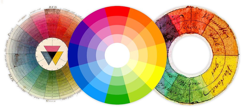
It somehow felt wrong introducing you to the world of colours and not include a section on the colour wheel, a tool that is so familiar to us all. However, although it is extremely useful to understand the basic structure of colour, it is not always a decorator's best friend. Despite this, let me explain you a bit more about the oh so famous colour wheel.
The original colour wheel was made up of six sections comprising three primary colours and three secondary colours, the warmer eing on one side and the cooler on the other. Primary colours are red, blue and yellow, which cannot be created from any other colours. Secondary colours are made up of equal amounts of primary colours mixed together, creating colours like green, orange or purple. The colour wheel that we are most used to seeing today has 12 sections and includes tertiary colours, which are combinations of primary and secondary colours: yellow-green, red-orange, and so on. This weel can certainly help you to understand how colours relate to each other - those that work together and those that don't.
Colours that sit side by side are known as analogous colours and are broadly harmonious when used together, resulting in natural-looking, tranquil spaces. You might think it would be easy to work with a scheme of harmonious colours, but careful consideration is required to avoid creating a room totally lacking in vitality when the contrasts are so subtle.
Complementary colours are any two that sit directly opposite each other on the wheel. Using these creates schemes with maximum contrast, resulting in dynamic and exciting rooms with a more primal intensity. A colour scheme of complementary opposites also needs to be carefully considered to achieve a pleasing balance. When strong colours are included among them, it is often best to offset them with neutrals.
I know, all these unfamiliar terms can be somewhat daunting and you should not get too caught up trying to remember them all. But your starting point may well be deciding whether you prefer a harmonious or a complementary scheme, and in this case the rules of the wheel can certainly be an aid in your colour selection. However, use it with caution. The infinite combinations and the relationship between colours are oversimplified in the wheel. There is so much more to creating a successful decorative scheme. Plus, everyone's perception of colour is different and it will continue to provoke debate forever - luckily.
° ° °
Overall, the color wheel is an essential decorating tool as long as you know how to use it. Below are the most popular color schemes created by using the color wheel. But before we start, keep in mind: blues, greens and purples tend to be cooler tones that are more calming, and oranges, yellows, browns, reds and pinks are warmer tones that are more exciting. Before you pick a color palette, it’s important that you know what kind of feel you want in your room.
Monochromatic Colours
Nothing says you have to decorate with a medley of colours. In fact, going monochromatic with tone-on-tone colour can result in a really sophisticated, edited look.Start with a colour you really love (thinking about what colour you wear the most is a good starting point), then have fun with mixing varying shades, from light to dark, or keep it classic by sticking to one shade. Everything is fair game, from the walls to upholstery to accessories.
Generally, a well-balanced room has both cool tones and warm tones, but not necessarily in equal amounts. So if you have a monochromatic colour scheme with all cool tones, warm it up a bit with a natural fiber rug, wood furniture and brass, black or oil-rubbed bronze finishes. Conversely, anchor a warm palette with white walls and neutral upholstery.
Analogous Colours
If you like the simplicity of the monochromatic colour scheme, but want more interest, the analogous colour scheme is for you. It’s a no-fail way of creating a successful colour combination with a mild contrast. It’s as simple as partnering two to three colours that are side by side on the wheel. The best way to create a cohesive look is to follow the 60-30-10 rule — 60 percent dominant colour, 30 percent secondary colour and 10 percent accent colour. To create a more relaxing vibe in a space, such as a bedroom, choose muted hues or cool tones. For a more energetic feel, go for more saturated hues or warm tones.
Complementary Colours
As they say, opposites attract. Choosing two complementary colours creates an energizing, high-contrast colour scheme. It’s also a pretty simple concept: pair two colours from opposite sides of the colour wheel, such as purple with yellow, blue with orange or red with green.
Obviously, you’ll want to look beyond the primary colours to create that winning combination of just the right shades. For example, invigorate a room with spa blue and a touch of coral, go global with aubergine and saffron or freshen up with raspberry and lime green. When we use two contrasting, vivid colours, we like to favor one colour over the other, or use both of them for accents against a neutral background. A healthy dose of white and plenty of natural light never hurts.
Triad Colour Scheme
Feeling adventurous? A triad coluor scheme is made up of any three colours evenly spaced on the wheel. This colour scheme creates a vivid contrast, but it’s balanced, so it feels a little less intense than a complementary colour scheme. Make it easy on the eyes, and let one colour dominate and accent with the other two. If you really want to go bold, use saturated versions of all three colours, or soften the colours and incorporate plenty of neutrals.


Comments